Burton Summer Sale
PROJECT OVERVIEW
Summer Sale is a true Burlington classic, but up until 2019, the identity was changing every year. The problem? People weren’t connecting with it long enough to really recognize it. So, we made a bold decision: create an identity that would stick around for 3–5 years before giving it a fresh update. The challenge was making sure it felt both timeless and relevant, while also being versatile enough to connect with consumers in all the different ways they'd encounter it. It was all about building recognition and excitement that would last!
With a blend of creative strategies, we aim to help you discover exactly what you need and perhaps even those additional items you’ve been eyeing. Embrace the season and gear up for your next adventure!
ROLES
Creative Direction: Rob Clegg
Design: Rob Clegg
Photography: Jesse Dawson
Production: Ally Healy
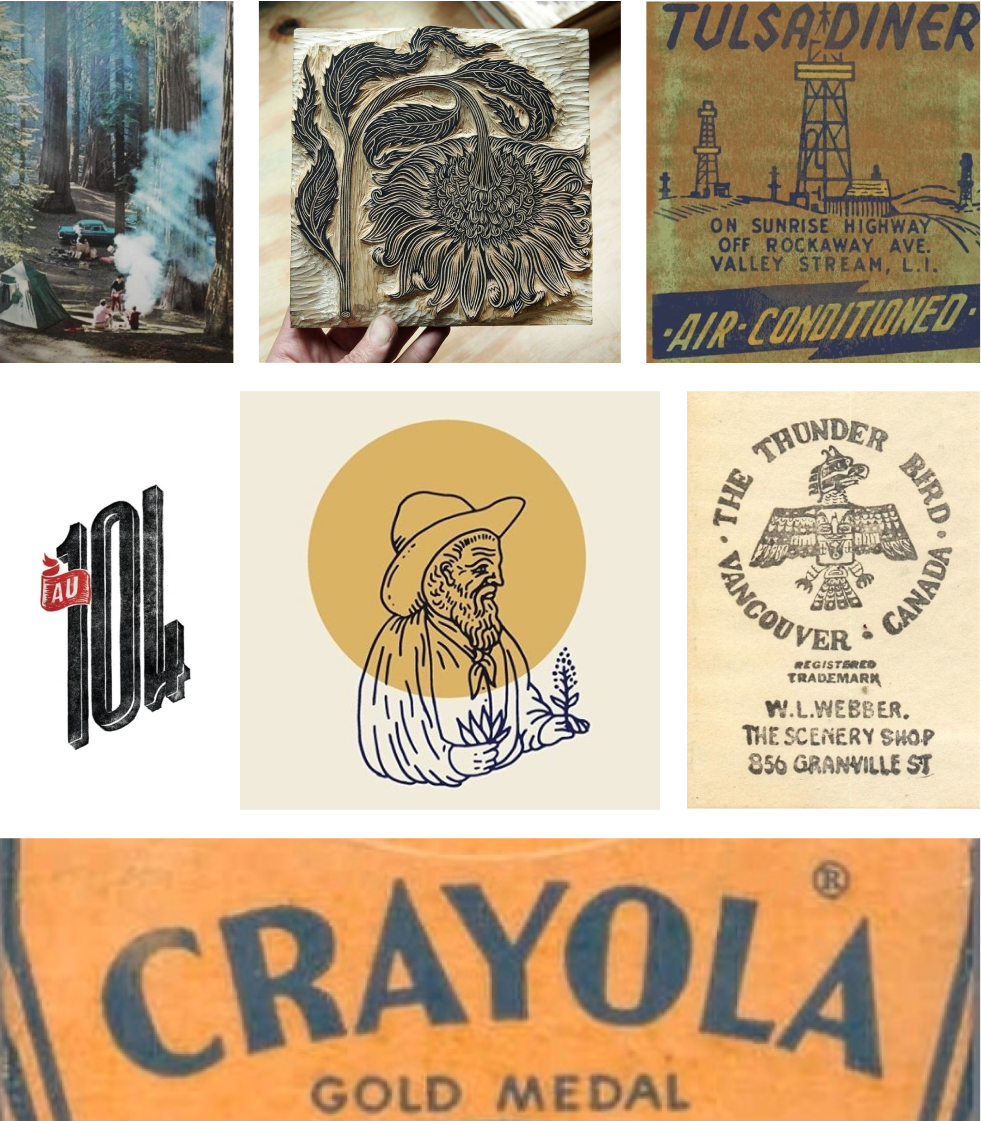
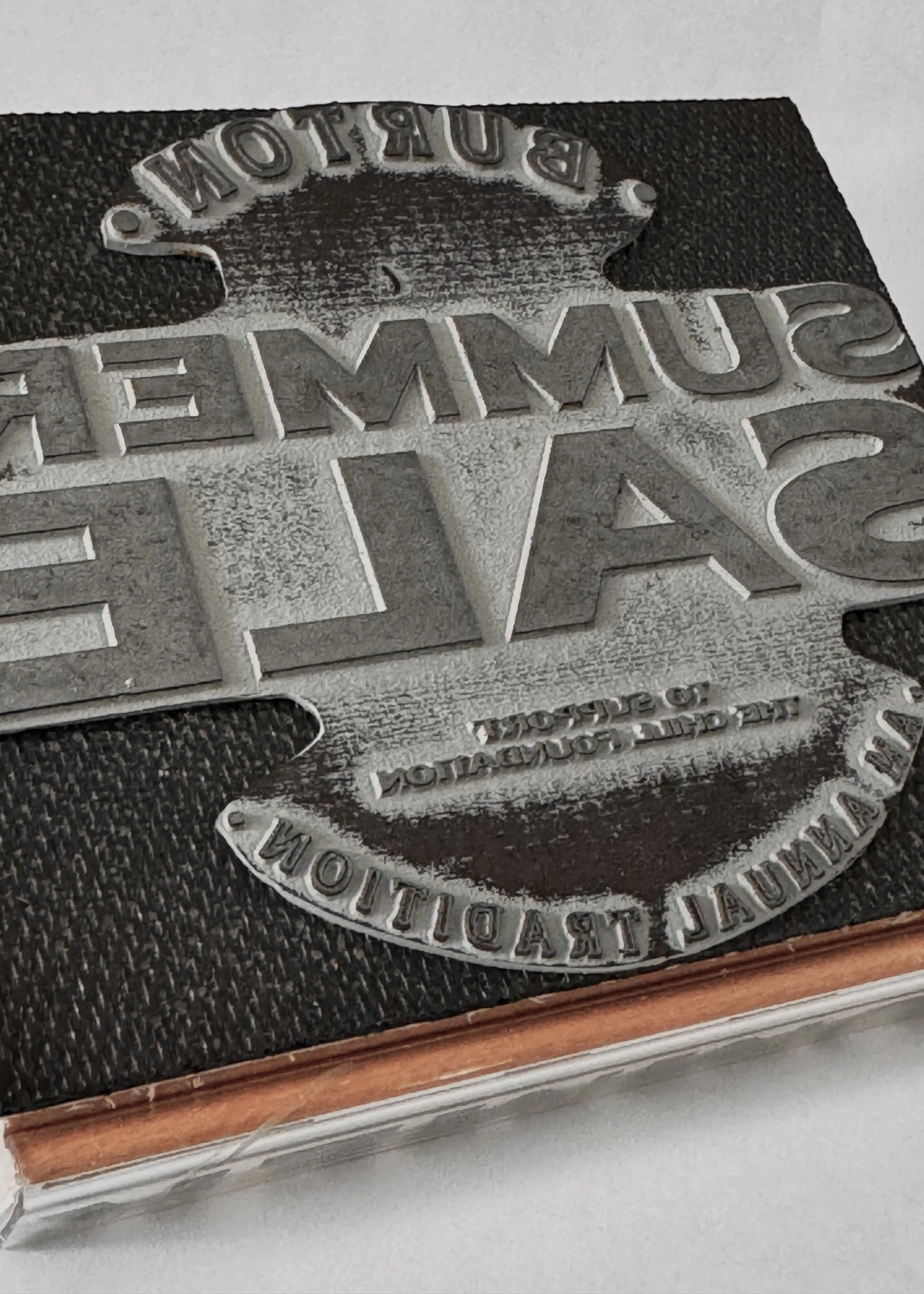
INSPO IMAGES
When I set out to design this campaign, I really liked the idea of summers gone by. That led me to photos like these. They have a warmth and nostalgia to them. Something that has some time under its belt. From the distressed stamp feel and the vintage fonts, these images exuded “Vintage Summer”.
SKETCHES
This project is all about capturing that vintage vibe from old logos and sale signs. Think bold typography, retro colors, and worn textures that make you feel like you’ve stepped back in time. It’s about blending classic design with a modern twist, keeping the nostalgia while making it fresh.
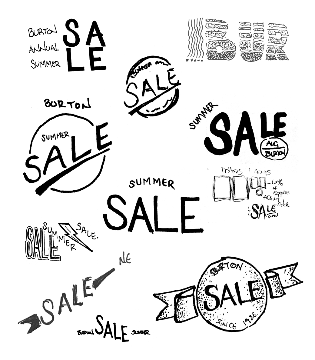
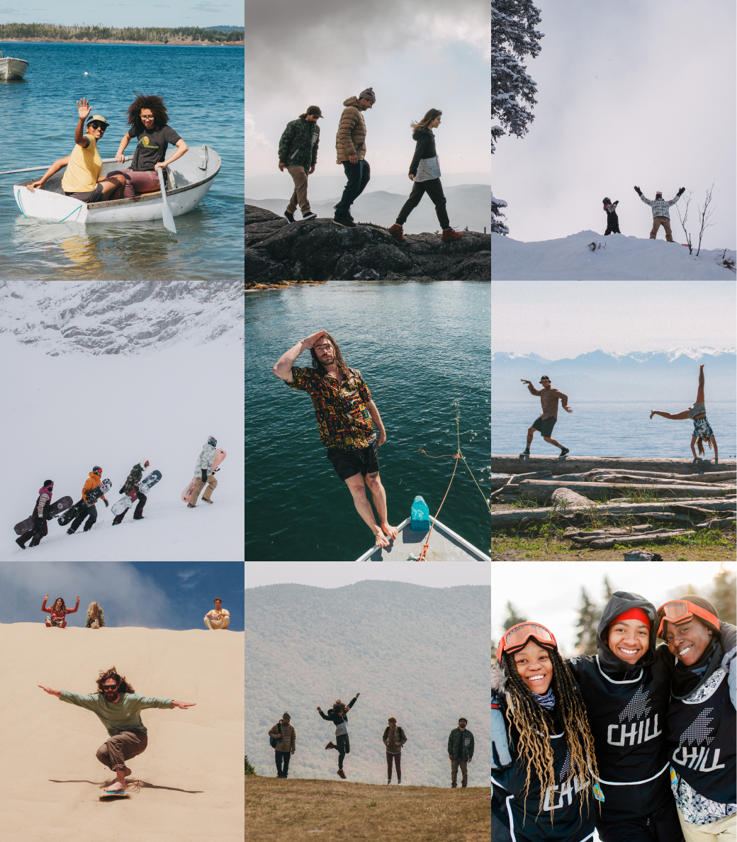
PHOTO SELECTION
When selecting photos for the campaign, I focused on two key feelings: freedom and movement. These concepts felt essential in capturing the essence of “Vintage Summer.” I wanted the imagery to evoke a sense of carefree energy and flow, embodying the nostalgia and spirit of summer from a timeless perspective.

COMING TOGETHER
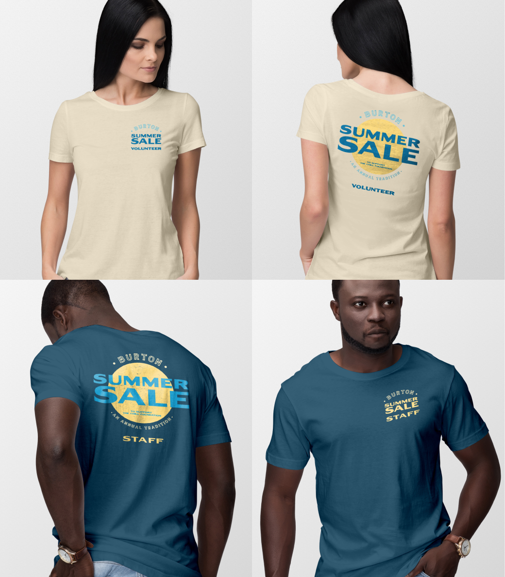
After refining the sketches, the final identity came together with bold fonts and an authentic stamp texture, capturing the essence of "Vintage Summer." Inspired by the photos, I chose colors and typefaces that evoke a nostalgic, carefree feel. Given that the sale features products we can’t guarantee are available, I treated the photos with a gradient overlay and noise to add grit, leveling the playing field and reinforcing the vintage summer vibe.


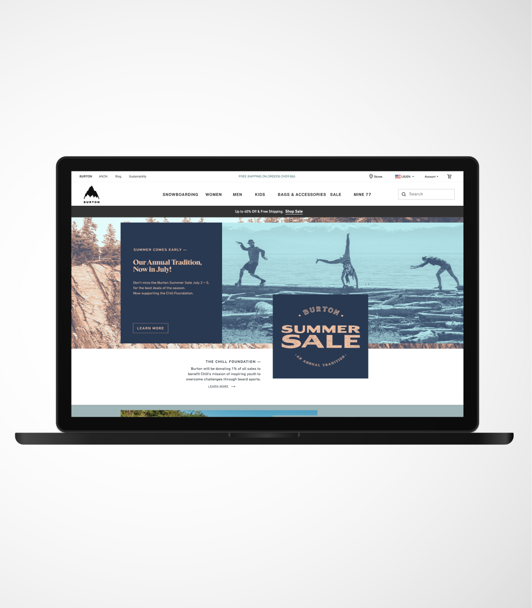
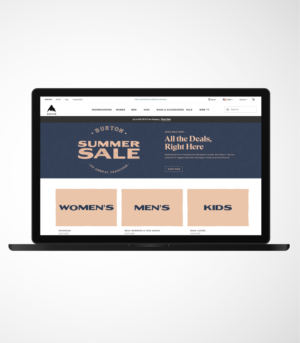
AND NOW, EVERYONE IN ACTION


NEW YEAR NEW LOOK
THE REFRESH
When we created the identity, the goal was to make it something that would stand the test of time and build real equity over the years. We wanted it to feel familiar enough to be instantly recognizable, but fresh enough to keep things exciting. So, we kept the overall look and vibe, but updated the color palette—giving it a little update each year to keep it feeling new and dynamic, without losing that core essence.
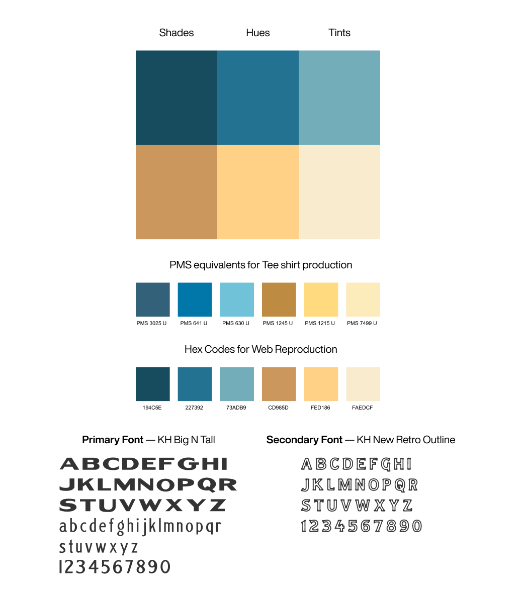
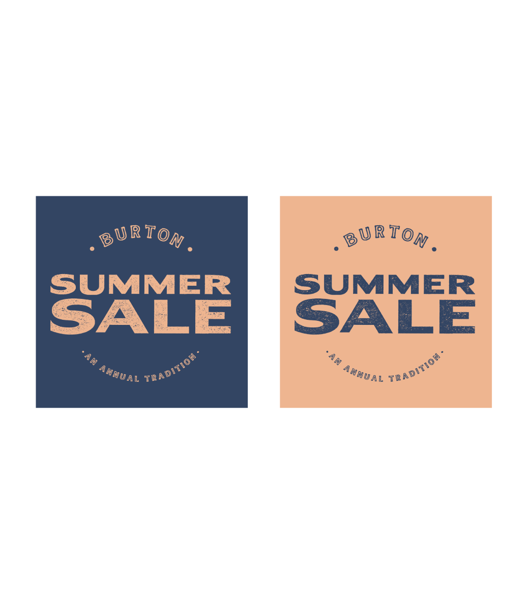
NEW COLOR PALETTE & PHOTO EXPLORATION
For this year, I kept that same dynamic 'movement' vibe we had going, looking for photos that really capture the energy—people celebrating or on the move. And to highlight that we offer both summer and winter items, I mixed in imagery that brings both seasons into play.
After experimenting with several color combos, I landed on a deep, late-summer blue paired with a warm peach. The blue gives a nod to those cool, breezy summer nights, while the peach gives off that sun-soaked, hot day feeling. It's the perfect balance of warmth and coolness—just like the sale itself!

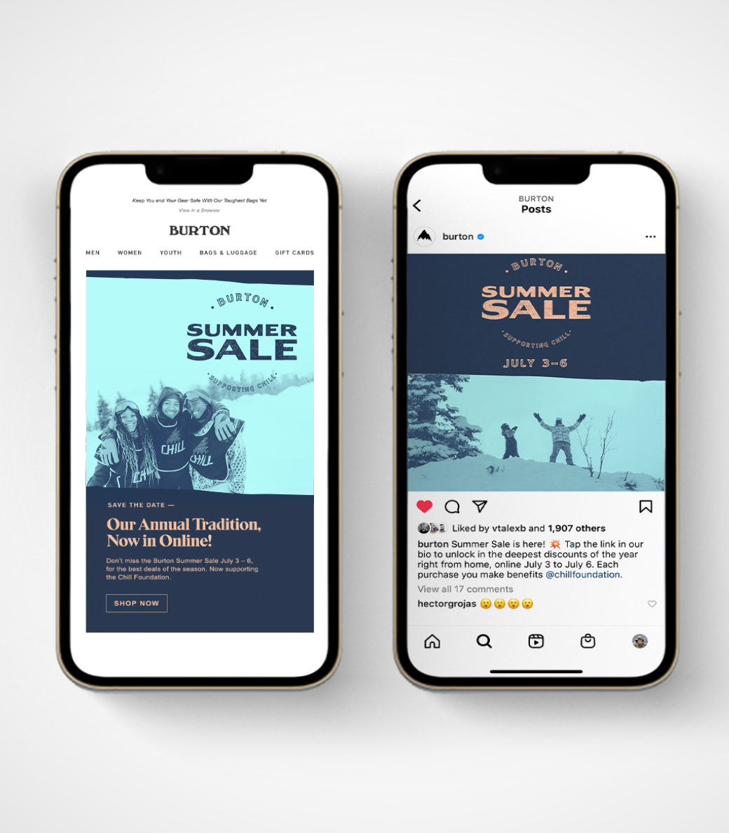
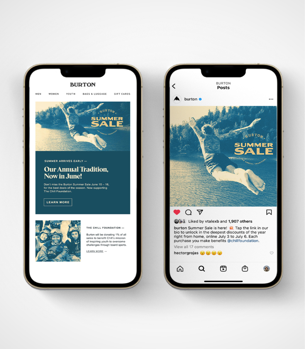
NEW DELIVERABLES
One of the biggest shifts this year was going all-in on a digital presence to share the Summer Sale excitement with everyone—especially for those outside the Burlington area. We wanted to make sure
the joy of the sale reached far and wide, no matter where people are!